Printing Like the Pros: Part One (Print Techniques)
Learn how to pick the right printing techniques for your project!

The right printing techniques can elevate your designs to the next level.
While it’s imperative to have a strong background in designing for digital environments these days, it’s SO important to hone your print design skills too. Print is not dead, not even close. Screens just cannot match the tactile magic that a good printed piece can provide (at least not yet!).
Whether you’re working with a client to create a stunning wedding invitation suite, creating your own printed products to sell, or bringing a branding project to life, having a solid understanding of printing techniques can totally change the game.
START WITH THE END IN MIND
Part of being a good designer is being a good planner. Start thinking about the final ending point of your design from the get-go, and make sure you consider any constraints such as budget, sizing, colors, etc… up front. Knowing where your boundaries are (and aren’t) will give you a great foundation to start from before you ever pick up a pencil to sketch.
When I’m beginning a new project that I know will end up in print, I’ll run through a series of questions like this:
What is the most important thing to convey through the final piece? Are you working for a luxury client that wants to portray the superior quality of their product? Are you wanting to create a statement piece that people will instantly notice from across the room? Or perhaps it makes more sense to focus on simplicity and clarity?
What is my budget? Knowing this up front is KEY. What’s the point in dreaming up a design that features 3 colors of foil and embossing if you’ve got a xerox budget? Of course, there’s always potential for an initial budget to expand or contract later, but having an idea up front will give you a ballpark. Then, you can plan for the low end, but also investigate what a little extra investment could get you without totally wasting your time on something that’s wayyyy out of the realm of possibility.
How many will you produce? Are you making a one-off or are you printing 12,000? Many printing processes require a lot of initial set up, such as the production of plates or the mixing of custom colors. Because of this, printers often set minimum orders for certain production techniques that may throw a wrench in your plans.
What general sizing should you consider? You don’t have to nail this down to the millimeter quite yet, but having a basic idea of size is important. Certain processes like foil stamping, for example, can be reasonably priced when used in smaller areas, but prohibitively expensive at large sizes.
Does your client already have a printer? Especially if you’re working with a big company, you’ll want to check if they have a current printer they are set on using, and, if so, you’ll want to know what that printer’s capabilities are. You don’t want to recommend a print technique that isn’t even on the menu, ya dig?
Once you’ve answered these questions, you’ll have a good idea of what you have to play with. Plus, it’s always easier to ideate once you have some constraints in place.
PRINTING TECHNIQUES: AN OVERVIEW
Let’s go ahead and chat about some different printing techniques that you may want to consider in future projects. I’ve selected some of my favorite and most-used print methods here, but if you’re interested in learning more about printing options, I’d suggest heading over to the Design-Wise Database put together by Mama’s Sauce print shop, the FAQs at Studio on Fire, or Oh So Beautiful Paper’s Printing Process blog section.
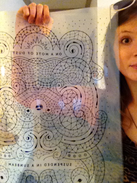
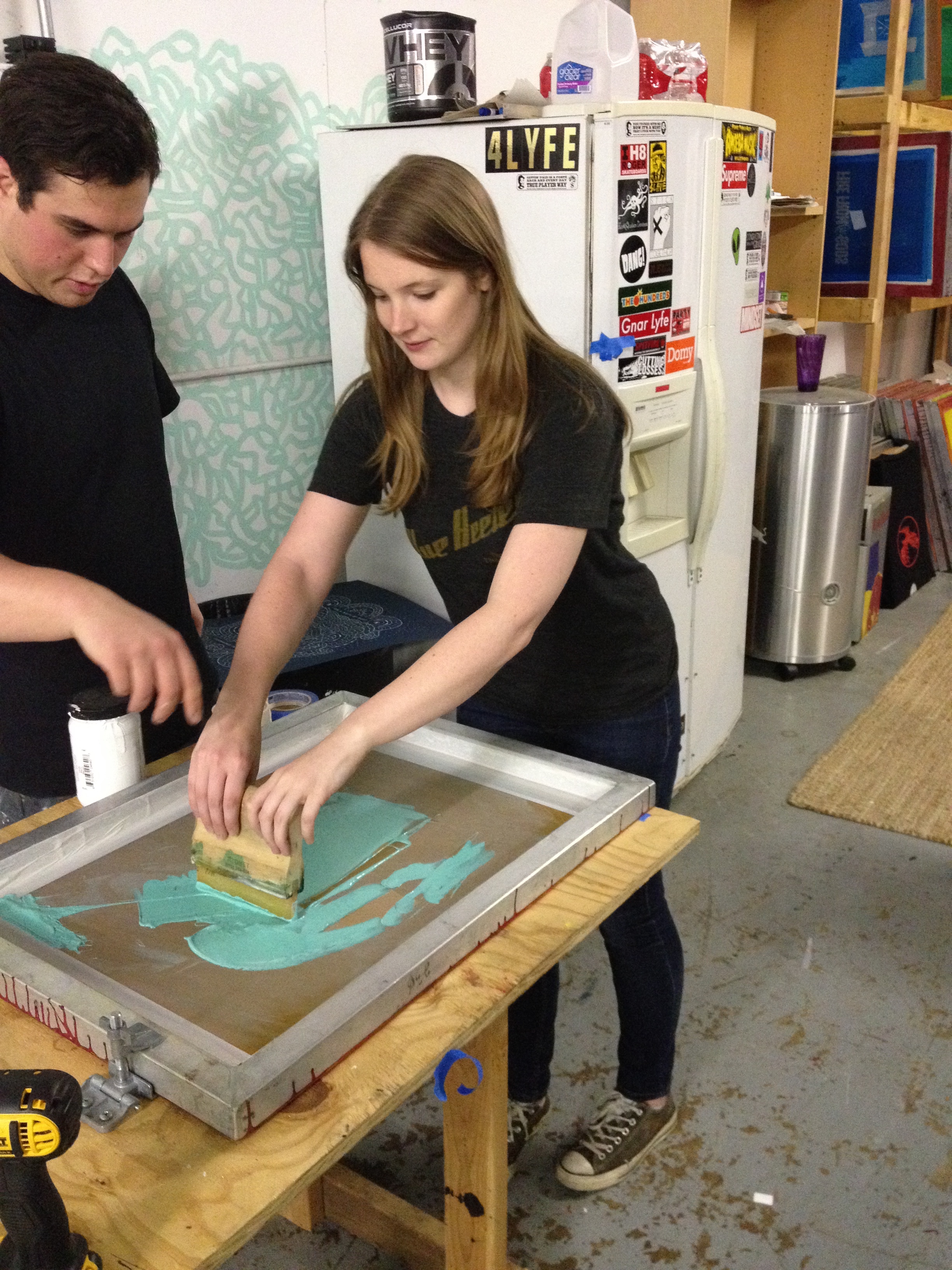
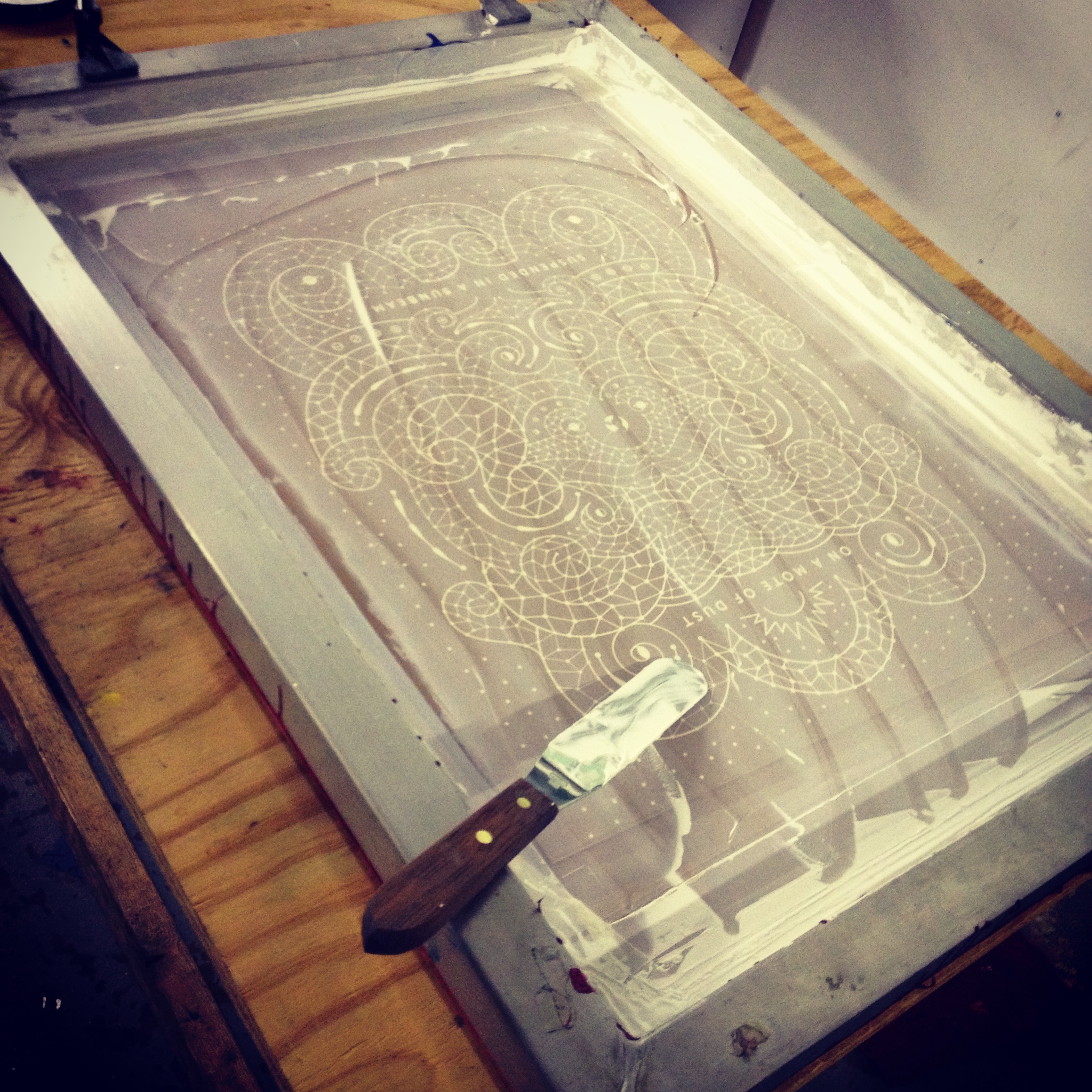
SCREEN PRINTING
One of my absolute favorite processes is screen printing. Screen printing is fairly inexpensive, can be produced quickly and in large sizes, can work on lots of various substrates in addition to paper, and produces gorgeous, vibrant results.
The Process
Screen printing involves transferring your design onto mesh screens and then pushing ink through those screens to make a print.
A Designer’s Guide to Screen Printing
When you design for screen printing, you have to separate each color that you’re using in your design. These are appropriately called separations. Because each color is printed individually, you need to limit the number of colors you plan to use (1-6 colors is typical). You also need to consider how colors will interact, if you plan to layer one color over another. In your print file, and when discussing the job with your printer, you’ll need to assign each of your separations a Pantone value (NOT a CMYK value). The printer will then custom mix inks to match the exact color you’ve specified.
***HOT TIP: Use your paper color as an extra color! You don’t have to print on plain ol’ white paper unless it works for your design.
Learn More
Check out this video about screen printing by the wonderful print shop Mama’s Sauce.
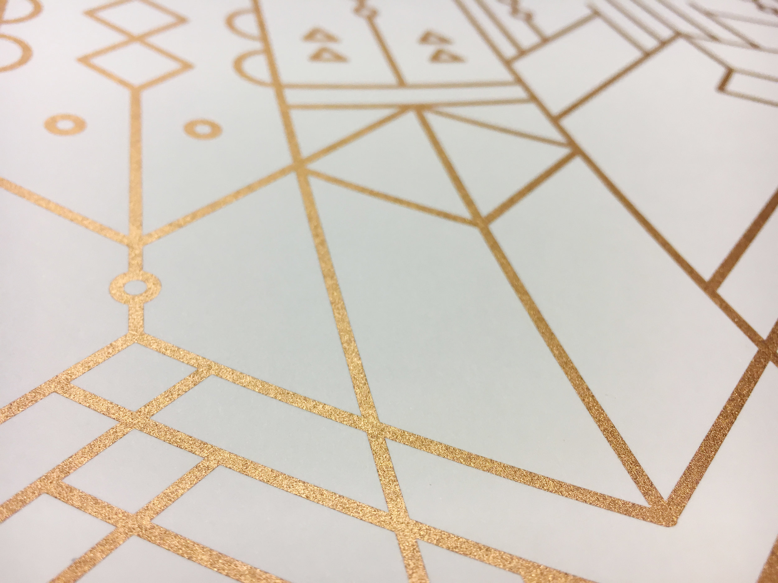
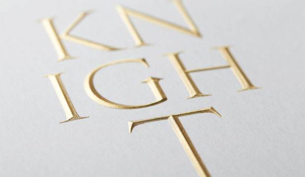
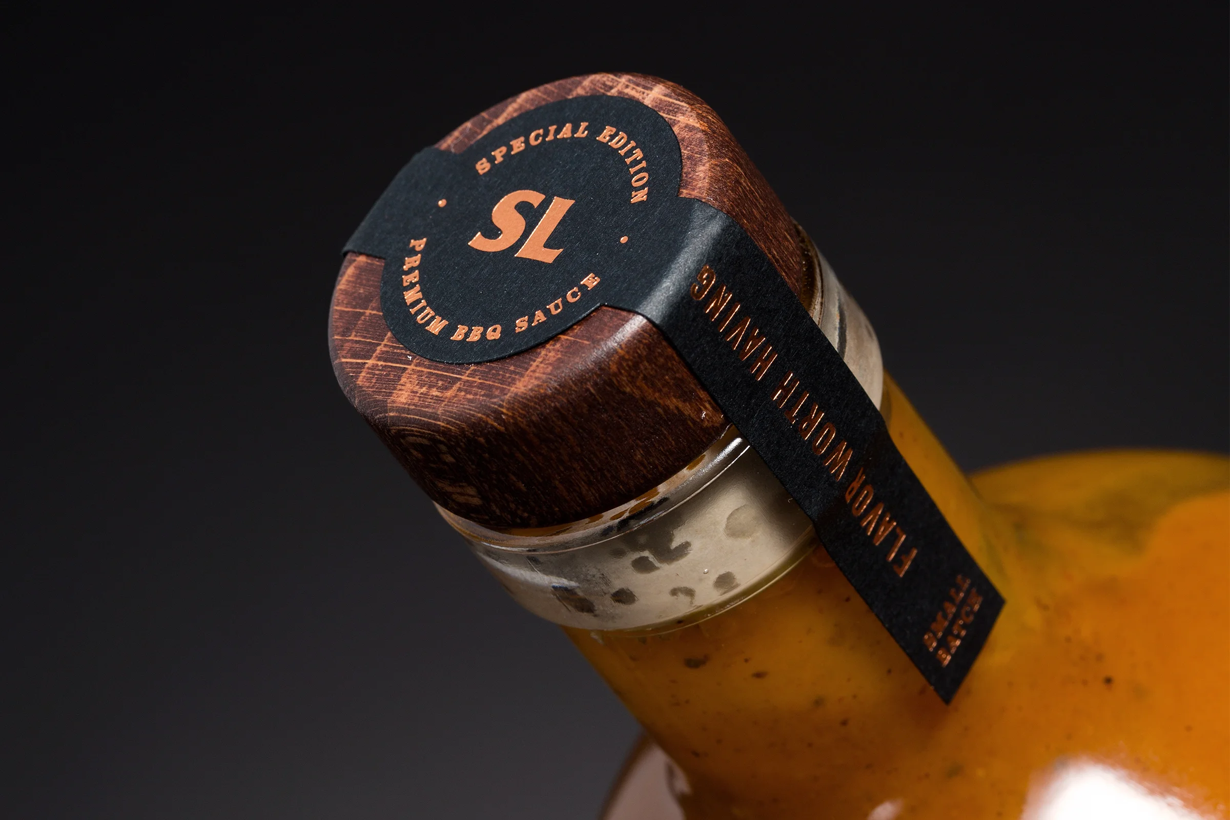
FOIL PRINTING
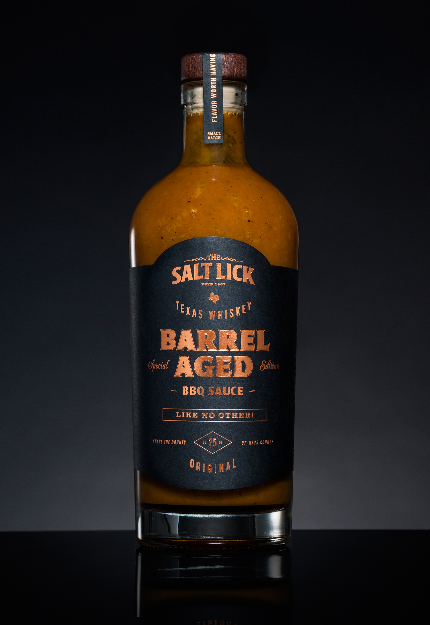

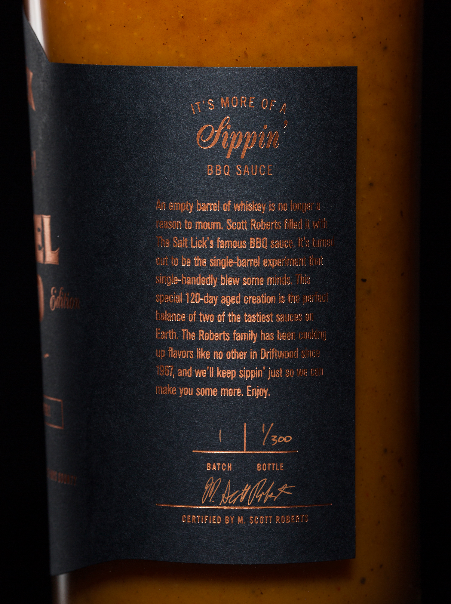
If you don’t love foil, then your heart must be a cold, dead place. It’s fun and shiny and makes any design instantly look luxe and professional. But, it can be pretty pricey, and you’re limited to only a small area unless you want to pay a small fortune!
The Process
Foil printing involves heating copper plates and stamping them against foil and paper by applying lots of pressure. The result is the transfer of the foil to the paper in the shape of your design.
A Designer’s Guide to Foil Printing
Each color of foil incorporated into your design requires the creation of a separate metal die, which is very costly. It’s typical to limit foil colors to 1-3, 3 being quite lavish. Just like with screen printing, that means every color you use needs to be separated in your file. Foils are sold in rolls and come in many colors and finishes. Ask your printer for samples or pictures of foils they’ve used in past projects to help you choose the color for your project. Gold, silver, copper, and holographics are classics that most printers have in stock. Unique colors like blues, reds, oranges, etc… are available, but will likely have to be special ordered and will therefore cost you more.
***HOT TIP: Be sure to run your design by your printer early on and ask if they foresee any issues. Foil can be finicky sometimes by closing small gaps or counters inside small type. Your printer can advise you on this!
Learn More
Check out this article on foil stamping by Oh So Beautiful Paper.
LETTERPRESS
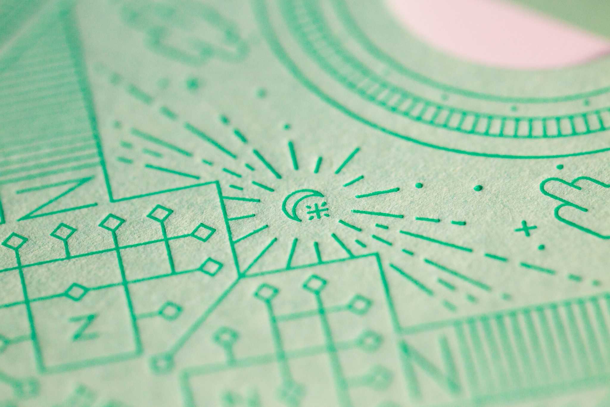
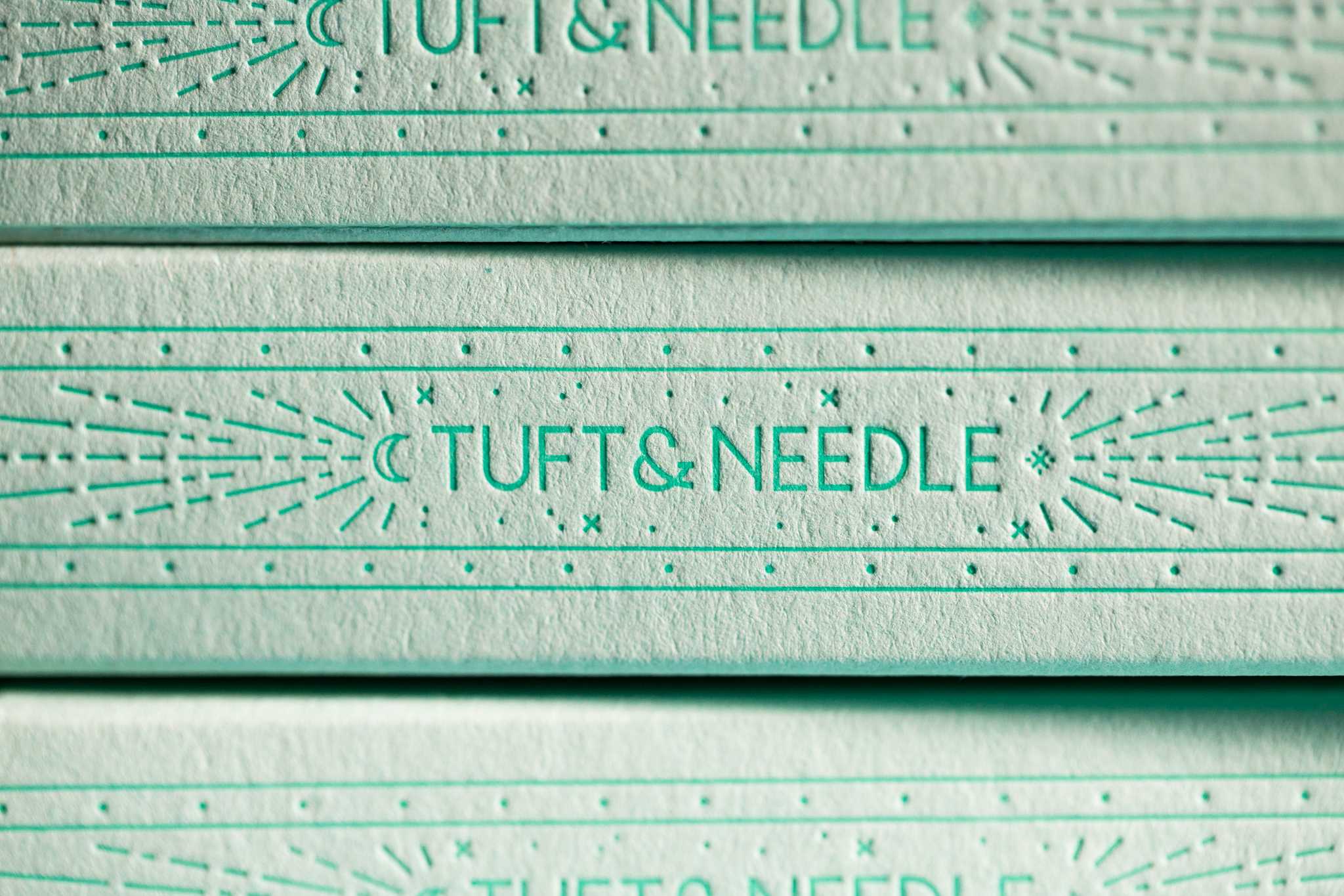
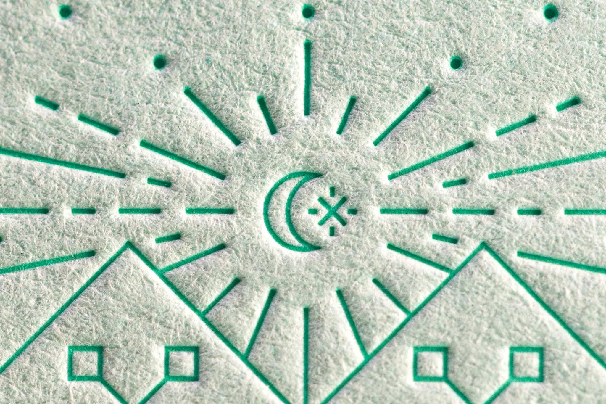
(Above images designed by Grand Army for Tuft & Needle, printed by Mama’s Sauce)
Letterpress is known for making designers drool. It adds a super tactile element that makes everyone want to reach out and touch and engage.
The Process
A plate is created that punches into the paper on one side, leaving an impression in the paper and depositing ink. Letterpress stands up really well to super thick paper stocks like the 100% cotton Crane’s Lettra.
A Designer’s Guide to Letterpress
Once more, you’ll need to separate different colors in your file, as each new color calls for the creation of a new plate. 1-3 colors is common for letterpress. When designing, it’s not advised to set type smaller than 6 pts or use super thin stroke weights (under .2” or so—ask your printer!). Be aware that letterpress inks are somewhat transparent, meaning some of the paper color will show through. This means it’s difficult to print light ink colors on dark paper. It can be done, but usually with a combination of techniques and for a higher fee.
***HOT TIP: Printers have some control over the depth of the impression that your design will leave in the paper. Talk to them about the effect you’re hoping for!
Learn More
Check out this video about letterpress by the wonderful print shop Mama’s Sauce.
EMBOSSING
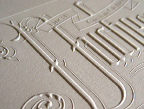
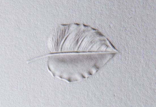
(Above images sourced from FCCartons, Ball & Doggett, & Zeven Design)
Embossing can be a gorgeous and dramatic way to elevate your design by physically transforming a paper surface.
The Process
Embossing involves pressing two plates together (a male & female plate) to create a raised impression in paper. The opposite process, debossing, creates a depression in the surface of the paper. Embossing dies can leave single-level, double-level and multi-level impressions; a sculptural die can even be created to make paper look like a 3D object (see the leaf impression above—super cool but really pricey).
A Designer’s Guide to Embossing
Embossing doesn’t transfer ink, but it can transfer foil if you use what’s called a combination die. You have several options: 1) blind emboss, which is just an impression with no ink (this can be really impactful and nuanced), 2) emboss with foil, and 3) registered emboss (you’d print ink with another process, and then line up the emboss on top). What you choose really depends on the look you’re trying to achieve.
Learn More
Check out this article on debossing by Zeven Design.
DIE CUTS
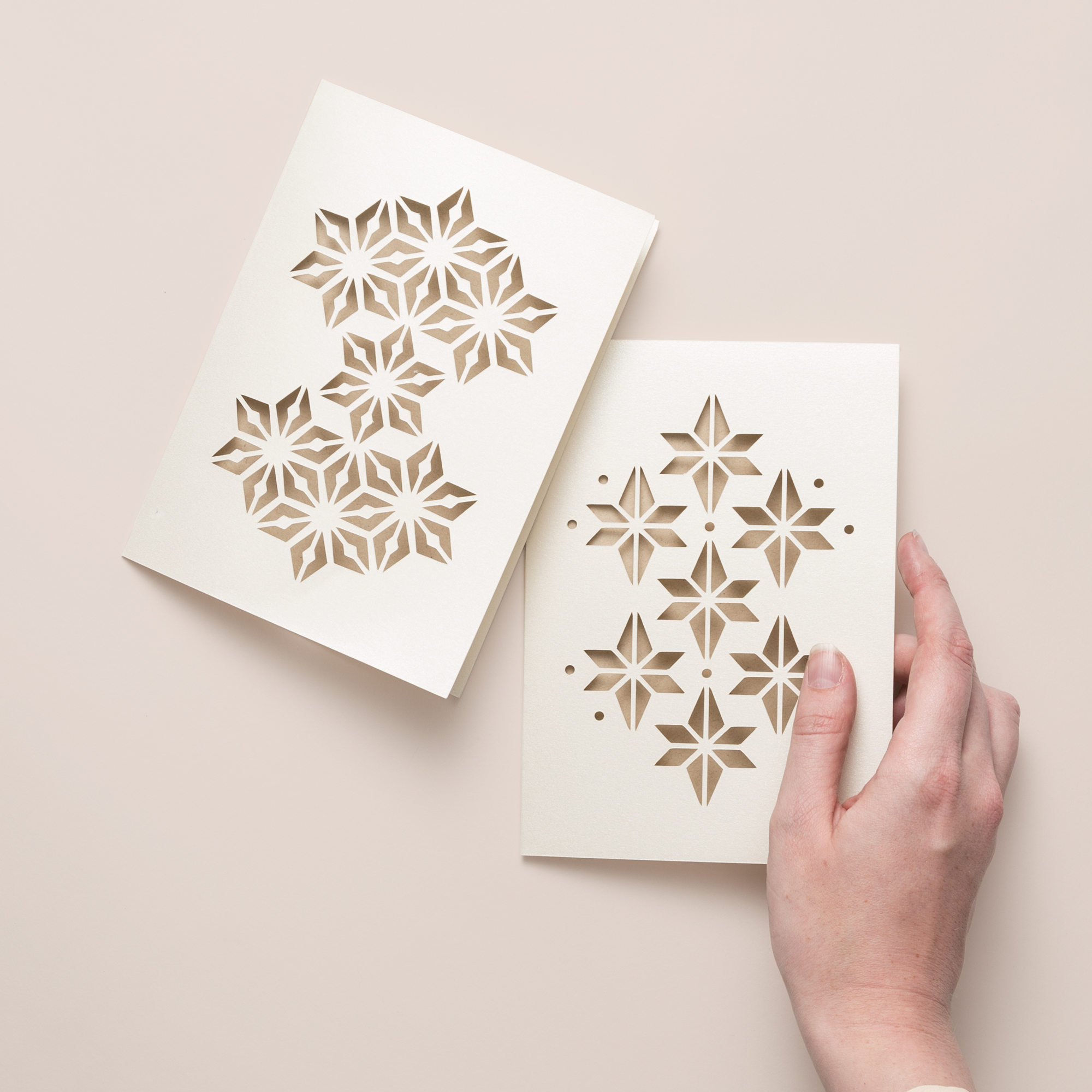
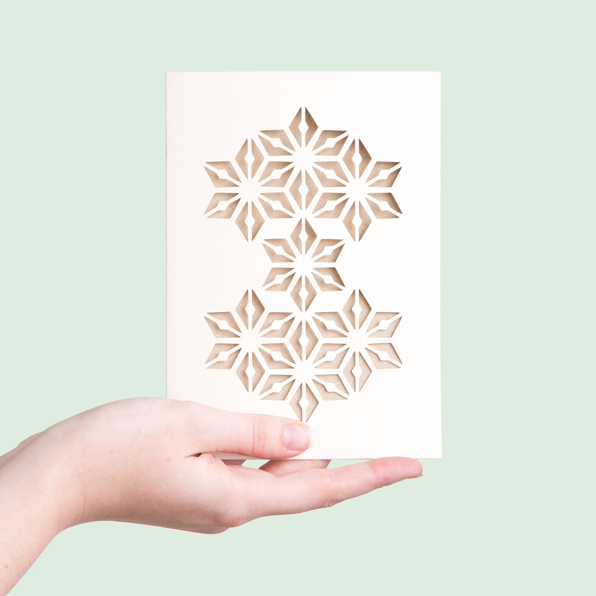
While die cuts don’t actually involve putting ink to paper to create a print, I’m including them in this list because of their ability to transform a print job into something that feels ultra-custom.
The Process
Die cutting includes using a sharp die to cut paper to a specific shape. You may choose a common shape that the printer already has on hand, such as a rounded corner die or a circle. Or you might choose to have a custom die created so you can really make an impact that feels unique. Die cuts are commonly used in packaging design. Die cuts can be made around edges, or shapes can be cut out of the interior.
A Designer’s Guide to Die Cuts
Die cuts are pretty straight forward from a design and preparation standpoint. Simply create a vector shape to mark the desired cut and create a thin rule line around the edges. If the die cut is along the edge of the paper, offset the edge by 1/8” to create a bleed. And that’s about all that you should need to do!
***HOT TIP: Be sure to print and cut out a mock up of your die cut to scale before you have it produced. You want to make sure it looks good at its final size, not just on your screen.
OFFSET & DIGITAL PRINTING
After all those fun techniques, plain ol’ offset and digital printing seems a little dull. But, these types of printing definitely have their time and place. In fact, the majority of print jobs are done with digital or offset for the simplicity, timeliness, and cost effectiveness.
Digital vs. Offset
Digital and offset are two different processes. Digital printing involves printing directly from a digital image to an inkjet or laser printer using toner or liquid ink. When low quantities are needed for cheap, this is your ticket! Offset printing uses aluminum plates to roll images onto what’s called a “blanket,” and then on to paper sheets. Offset is really efficient for large runs. One strong advantage of offset is the ability to match Pantone colors. A large greeting card company printing 12,000 cards might choose offset, while a small business printing 100 flyers might prefer digital printing.
A Designer’s Guide to Digital & Offset
Digital printed files should use CMYK color modes unless otherwise specified by your printer. There’s no need to separate colors into layers for this technique. For offset printing, your printer will create your C-M-Y-K separations for you (each color gets its own plate). However, if you choose to color match to Pantones, you should work in color layers, and assign each color a Pantone within your file. The offset printer should be calibrated to create as close of a match as possible.
Learn More
Learn about the offset process via this video, or check out this weirdly dramatic video about digital printing.
CHOOSING YOUR PRODUCTION TECHNIQUES
One of the most important things you can do as a designer is to know your options. Know what’s possible! Do your research (good on you for doing some right this moment!). Keep your eyes out for beautifully printed objects in the wild and collect them for future inspiration. Scour Pinterest and try to figure out how gorgeous printed pieces have been produced. Store all that inspiration in your back pocket.

Then, like I said in the beginning of this post, put some limitations on yourself. Go through the list of questions I mentioned above and start thinking about the production techniques that line up with the goals and needs of your specific project. Need a small run for cheap? Sounds like a job for digital printing. Want to create a limited edition of modern looking posters with a small to medium budget? Might be a job for screen printing…perhaps with a metallic ink! Designing a business card for a high-profile client who wants to show off a little? Maybe letterpress on a duplexed (doubled) paper stock.
If you have a general look in mind that you’d like to achieve, but you’re not sure what process makes the most sense financially or logistically, ask your printer what they recommend (more on this in Part Two). They’re the experts and they are there to help you (or at least, they should be).
It’s really important to find a good mix between having a vision for a beautiful final piece and being realistic. You may envision the most gorgeous sculptured emboss with all the bells and whistles, but if it’s up to a client to foot the bill, make sure you’ve got a back up option that also looks great just in case they don’t buy it. I’m not trying to crush your dreams here—there are TOTALLY clients out there who value beautiful printing (and it’s also part of your job to convince them of that value), but often they are not willing to fork out the bucks for the really luxe stuff. That being said, there are some folks, like Chad Michael Smith, who specialize in making ridiculously luxurious designs. If print design really gets your goat, consider making work that attracts the clients who have the budgets and the desire for it!
